
Basic Candlestick Charts
Understanding Basic Candlestick Charts - A Comprehensive Guide
12/20/20246 min read


Understanding Basic Candlestick Charts: A Comprehensive Guide
Candlestick charts have been a staple in technical analysis for centuries, offering valuable insights into market trends and trader psychology. Originating in Japan over 100 years before Western bar and point-and-figure charts, these charts were developed in the 1700s by a Japanese rice trader named Homma. He discovered that the price of rice was not only influenced by supply and demand but also by the emotions and behavior of traders. This realization laid the foundation for what would become one of the most widely used tools in trading today.
In this blog post, we will explore the key components of candlestick charts, compare them with bar charts, and dive into some of the most common candlestick patterns used in market analysis.
Candlestick Components: Breaking Down the Basics
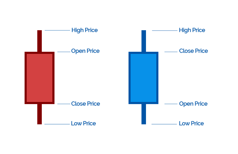
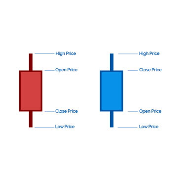
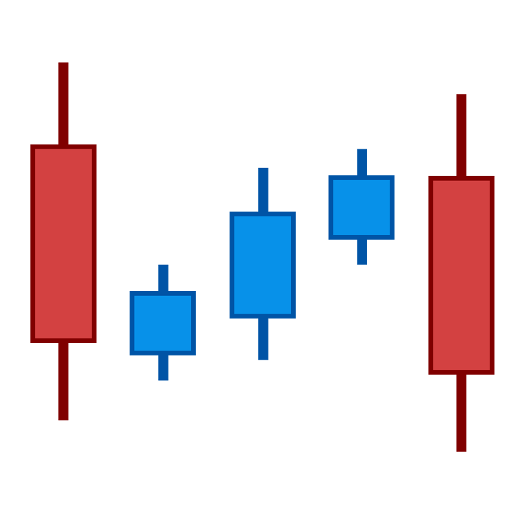
A candlestick chart displays the market’s open, high, low, and close prices within a given time period. Each individual "candlestick" represents one period - whether that's a minute, hour, day, or week - depending on the timeframe selected.
Each candlestick is composed of several distinct parts.
The Body: This is the wide section of the candlestick and represents the range between the opening and closing prices of the period. A green (or white) body indicates a bullish period, where the close is higher than the open. A red (or black) body represents a bearish period, where the close is lower than the open.
The Wicks (Shadows): Above and below the body, you'll notice the thin lines, known as wicks or shadows. These represent the high and low prices during the period. A long wick suggests that the price moved significantly during the period but closed near the open, while a short wick indicates little price movement away from the open.
Candlestick vs. Bar Charts
Both candlestick and bar charts display the same data - open, high, low, and close - but the visual presentation differs. In a bar chart, the data is displayed as vertical lines (bars) with small horizontal ticks on the left and right to indicate the open and close prices.
Candlestick charts, on the other hand, provide a more intuitive visual representation with their colorful bodies, which make it easier for traders to quickly gauge market sentiment. The color of the body (green for bullish, red for bearish) provides a quick indication of whether the market is moving up or down.
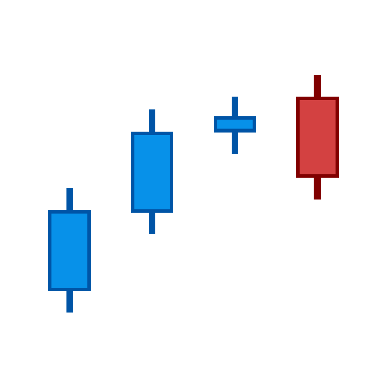
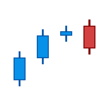
Basic Candlestick Patterns: Decoding Market Sentiment
Candlesticks often form patterns based on the price action they represent. These patterns can be bullish or bearish and are used by traders to predict potential market movements. Below are some of the most common candlestick patterns and their implications:
Bearish Engulfing Pattern
The Bearish Engulfing Pattern occurs in an uptrend when a large red (bearish) candlestick engulfs a smaller green (bullish) candlestick. This indicates that the bears (sellers) have overtaken the bulls (buyers), and the price may continue to fall.
Bullish Engulfing Pattern
The Bullish Engulfing Pattern is the opposite of the bearish engulfing pattern. It occurs in a downtrend when a large green (bullish) candlestick engulfs a smaller red (bearish) candlestick. This pattern signals that the bulls are gaining control, and the price may rise.
Bearish Evening Star
The Evening Star is a topping pattern that signals a potential reversal of an uptrend. It consists of three candles: a large bullish candle, followed by a small-bodied candle (often a doji), and then a large bearish candle that closes deep into the first candle’s body. This indicates a loss of momentum among buyers and suggests that sellers are taking control.
Bullish Morning Star
The Morning Star is the opposite of the Evening Star and signals a reversal of a downtrend. It consists of three candles: a large bearish candle, followed by a small-bodied candle (often a doji), and then a large bullish candle that closes deep into the body of the first candle
Bearish Harami
A Bearish Harami occurs when a small bearish body is completely contained within the body of a larger bullish candle. This pattern signals indecision among buyers, and while it doesn't necessarily indicate an immediate trend reversal, it is a sign to watch for potential weakness in the uptrend.
Bullish Harami
The Bullish Harami is the opposite of the bearish harami. It occurs when a small bullish body is contained within a larger bearish body during a downtrend. This pattern suggests that the trend may be pausing, and a reversal to the upside is possible if followed by further bullish price action.
Bearish Harami Cross
The Bearish Harami Cross occurs when a bullish candlestick is followed by a doji (a candle with a very small or no body, where the open and close prices are nearly identical). The doji must be contained within the body of the previous candlestick. This pattern suggests indecision and a potential reversal to the downside.
Bullish Harami Cross
The Bullish Harami Cross is the opposite of the bearish harami cross. It occurs during a downtrend, where a bearish candlestick is followed by a doji. This pattern can indicate a potential reversal to the upside.
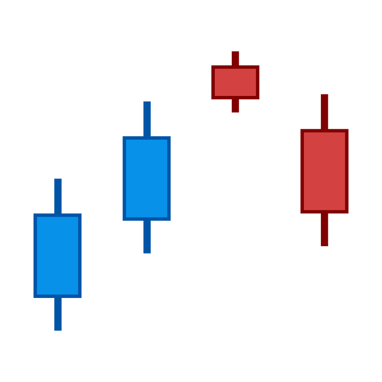
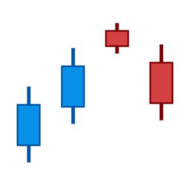
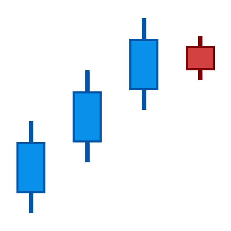
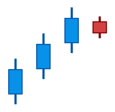
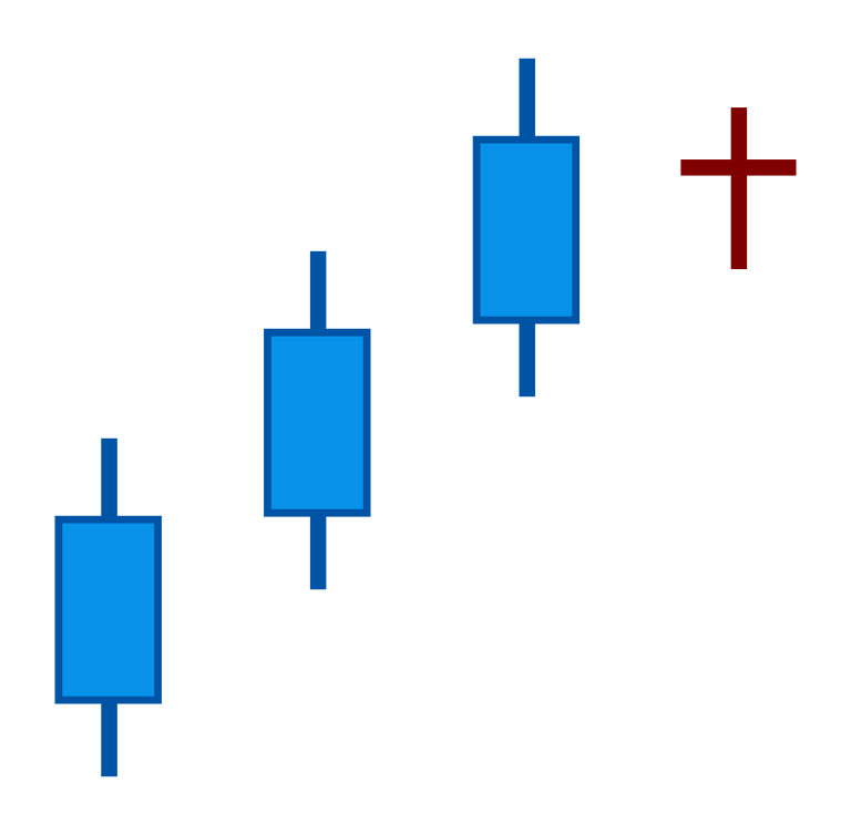
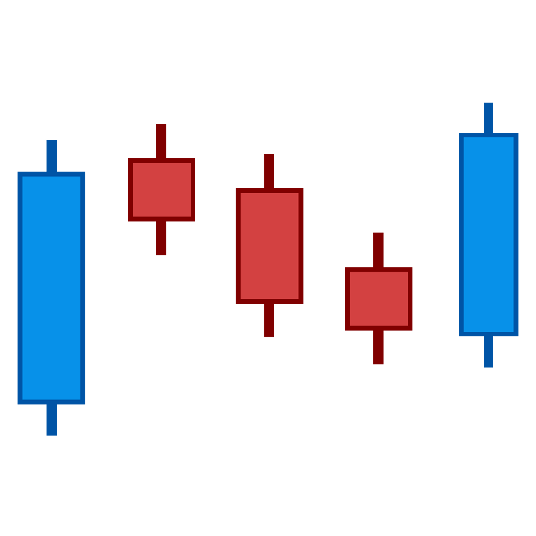
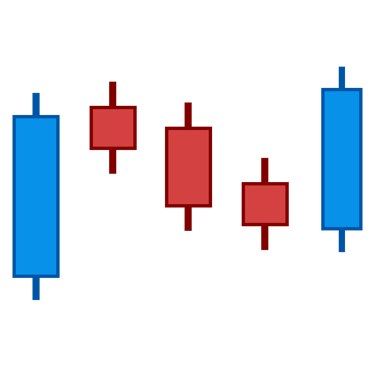
Bullish Rising Three
The Bullish Rising Three is a continuation pattern that suggests the market is consolidating before a move higher. It starts with a large bullish candle, followed by three small bearish candles that stay within the range of the first candle, and ends with another large bullish candle. This pattern indicates that, despite a brief pullback, the bulls are still in control.
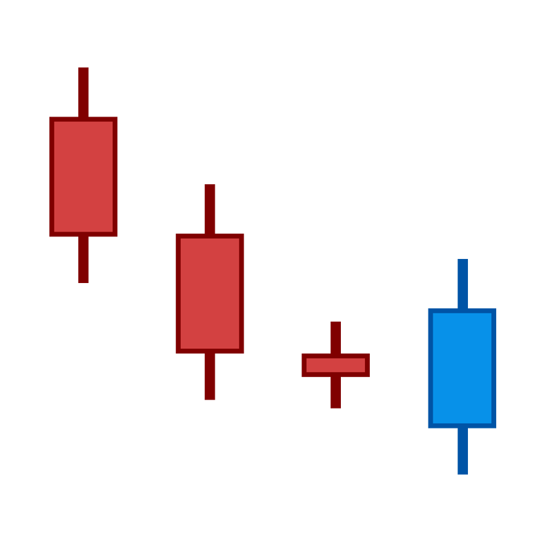
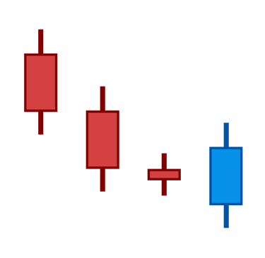
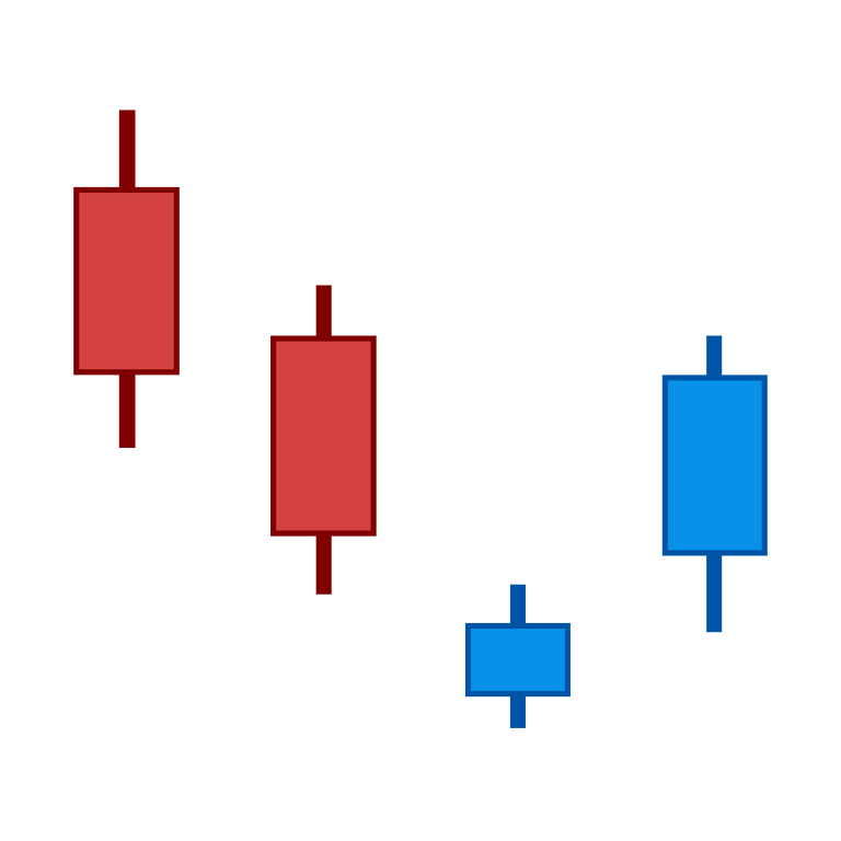
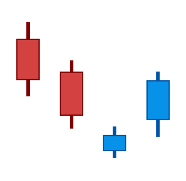
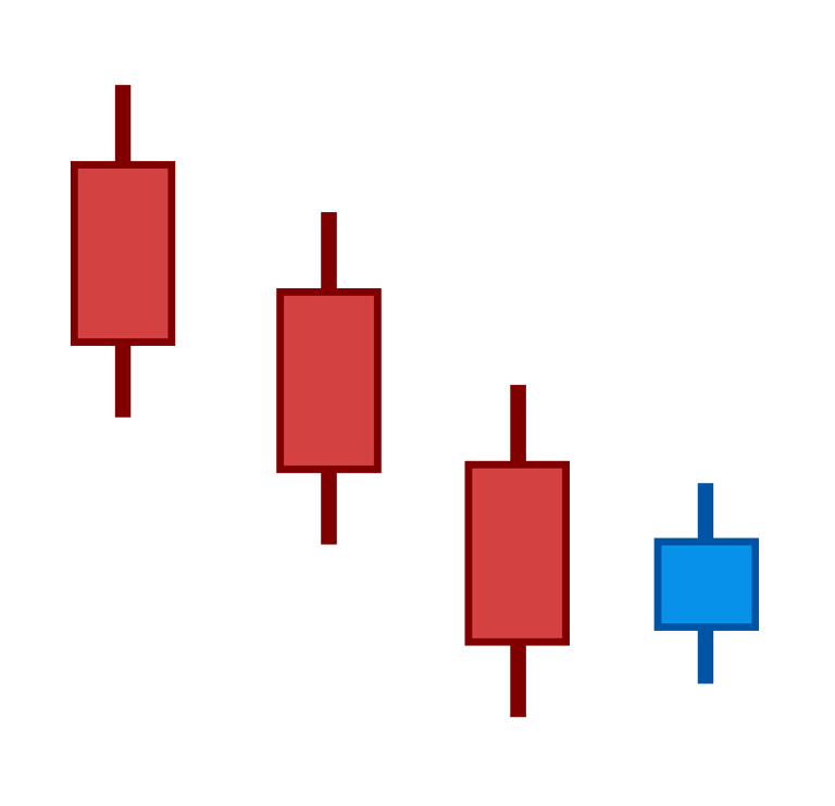
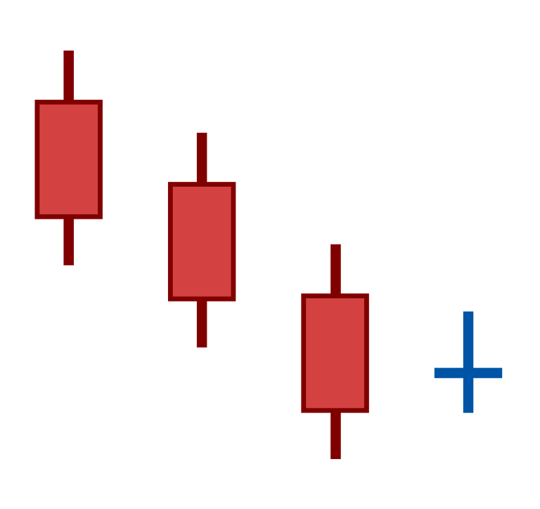
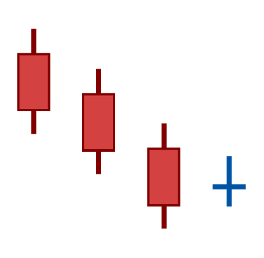
Bearish Falling Three
The Bearish Falling Three is the opposite of the Bullish Rising Three. It begins with a large bearish candle, followed by three small bullish candles that remain within the range of the initial down move, and finishes with another large bearish candle. This pattern suggests that the bears are regaining control, and further downside movement is likely.
What Candlestick Pattern Is Most Accurate?
While candlestick patterns provide valuable insights into market sentiment and potential price movements, it's important to note that there is no "most accurate" pattern. The reliability of a pattern depends on the context in which it appears, the overall market trend, and other technical indicators. Candlestick patterns should always be used in conjunction with other tools and analysis techniques.
The 3 Candlestick Rule
The 3 Candlestick Rule refers to the idea that three consecutive candles progressively opening and closing higher (in an uptrend) or lower (in a downtrend) indicate a potential trend reversal. Common three-candle reversal patterns include Three White Soldiers (bullish) and Three Black Crows (bearish).
The Bottom Line: Emotions Drive the Market
As early as the 1700s, Japanese rice traders understood that market prices were influenced not only by the fundamentals of supply and demand but also by the emotions and psychological behavior of traders. Candlestick patterns, developed from this understanding, remain a powerful tool in modern-day trading. By learning to recognize these patterns and applying them effectively, traders can gain deeper insights into market sentiment and improve their decision-making process.
Whether you are a seasoned trader or just getting started, mastering candlestick charting techniques is an essential skill for navigating the markets. As you practice recognizing these patterns, you will develop a stronger intuition for understanding price action and market behavior.
By incorporating these key concepts into your trading strategy, you can better identify potential market moves and make more informed decisions. Happy trading!
© 2025. All rights reserved.
You understand and acknowledge that there is a very high degree of risk involved in trading securities and, in particular, in trading forex, futures and options. Please ensure that you fully understand the risks involved. The site is providing educational content which will provide you with an indepth knowledge of the market. This site is in no way providing any investment, financial, tax, or legal advisory and do not purport to provide personalized investment, financial, tax, or legal advice in any form. None of the provided information does recommend the purchase of particular securities, nor does the provider promise or guarantee any particular results. The provider assumes no responsibility or liability for your trading and investment results, and you agree to hold the provider harmless for any such results or losses. It is up to you as a trader to make your own judgement using your own analysis.